

Frederick Lynch
A Solo Exhibition
July 5 – August 16, 2026
It is an honor to present Nola Parker’s debut exhibition with Sarah Bouchard Gallery.
In Under World, Parker fuses Greek mythology with the New England landscape on a journey toward healing. Parker leans into the darker spaces of her own inner world to arrive at stunning imagined lands drawn from lived experience and fantastical places.
Each painting is a testament to the brilliance of the human psyche in the face of the unfathomable.


Frederick Lynch
Frederick Lynch (1935–2016) was a celebrated Maine artist whose work explored the intersection of nature, structure, and abstraction. Known for his intricate compositions and sophisticated use of color, Lynch developed a distinctive visual language inspired by the patterns and systems found in the natural world. Over a career spanning more than five decades, he became one of Maine’s most respected abstract painters.
A dedicated educator as well as an accomplished artist, Lynch taught at the University of Southern Maine and influenced generations of emerging artists. His work is represented in numerous public and private collections, including the Portland Museum of Art and the Farnsworth Art Museum.
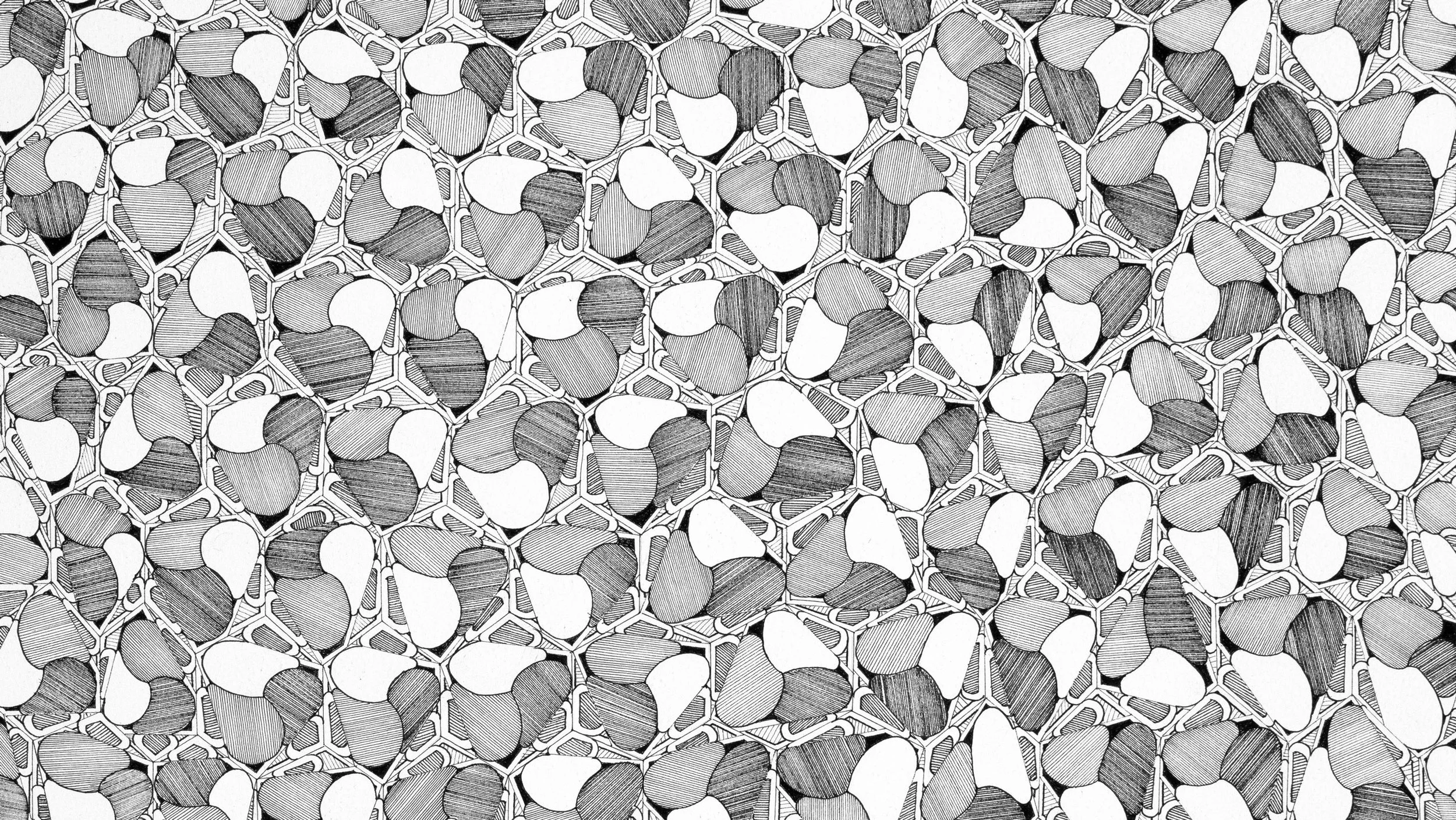
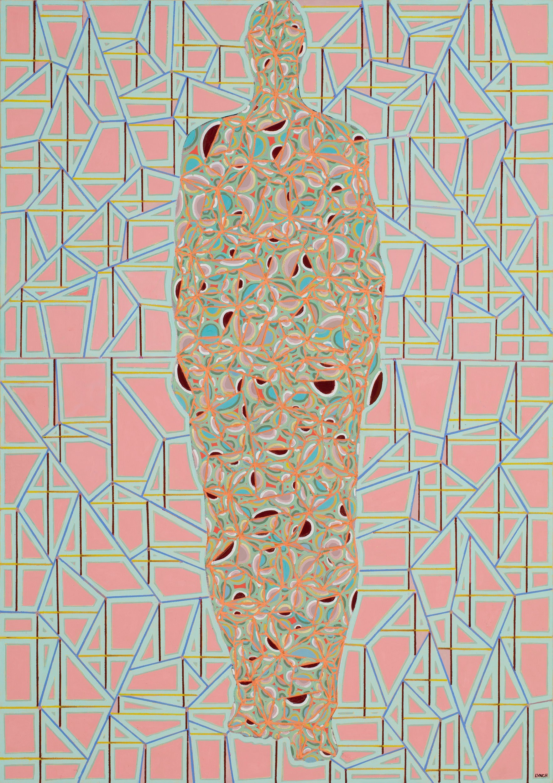
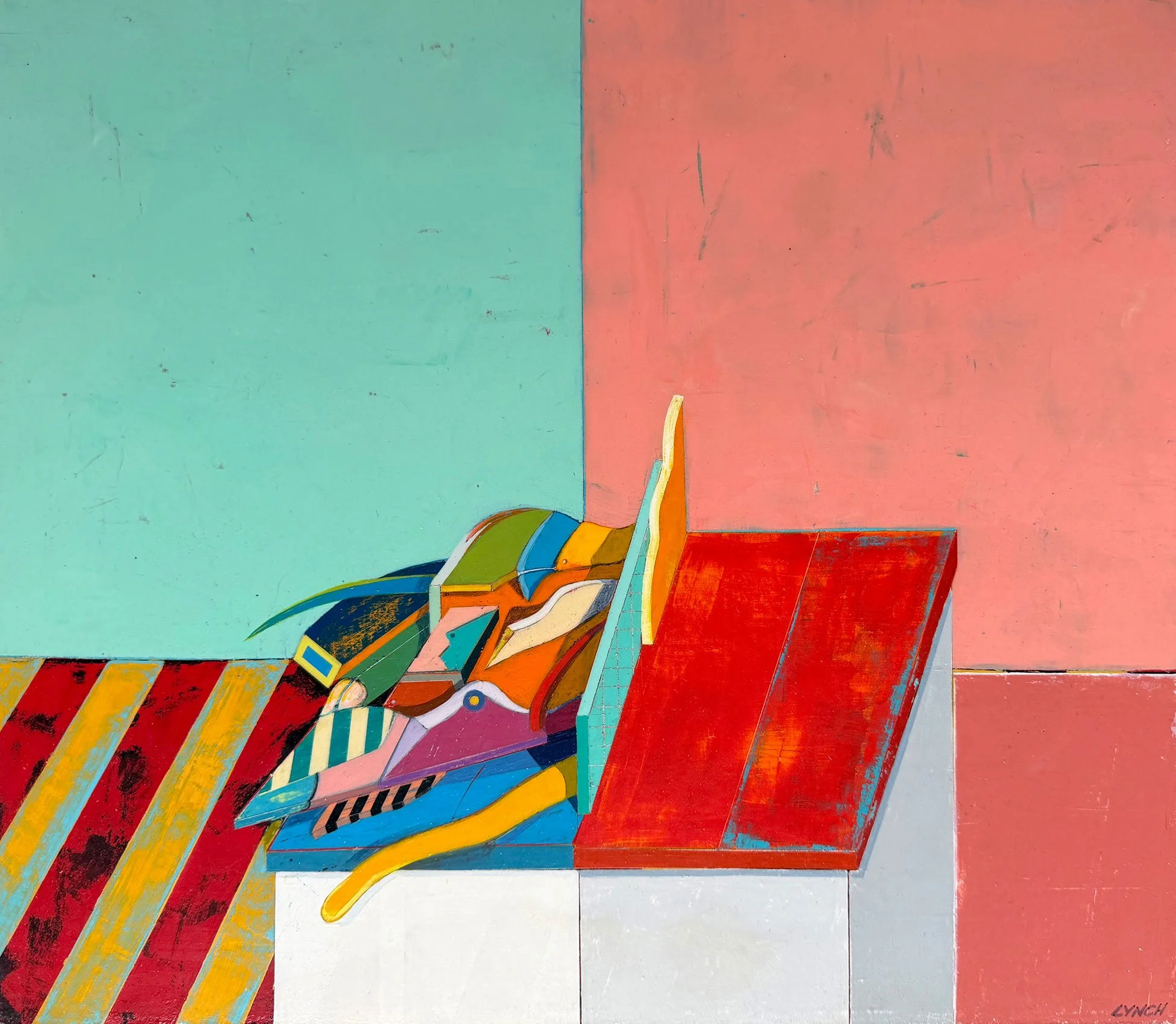
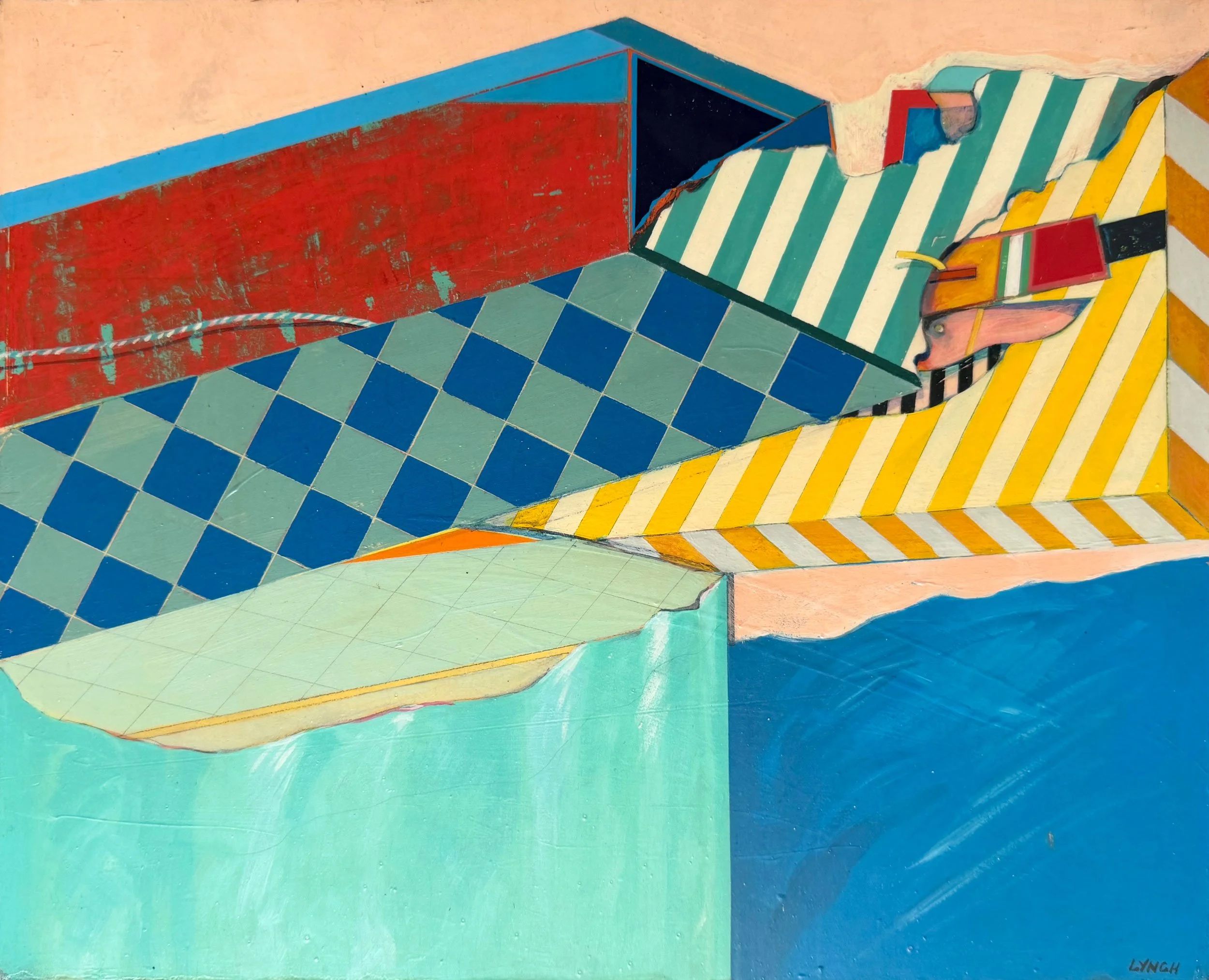
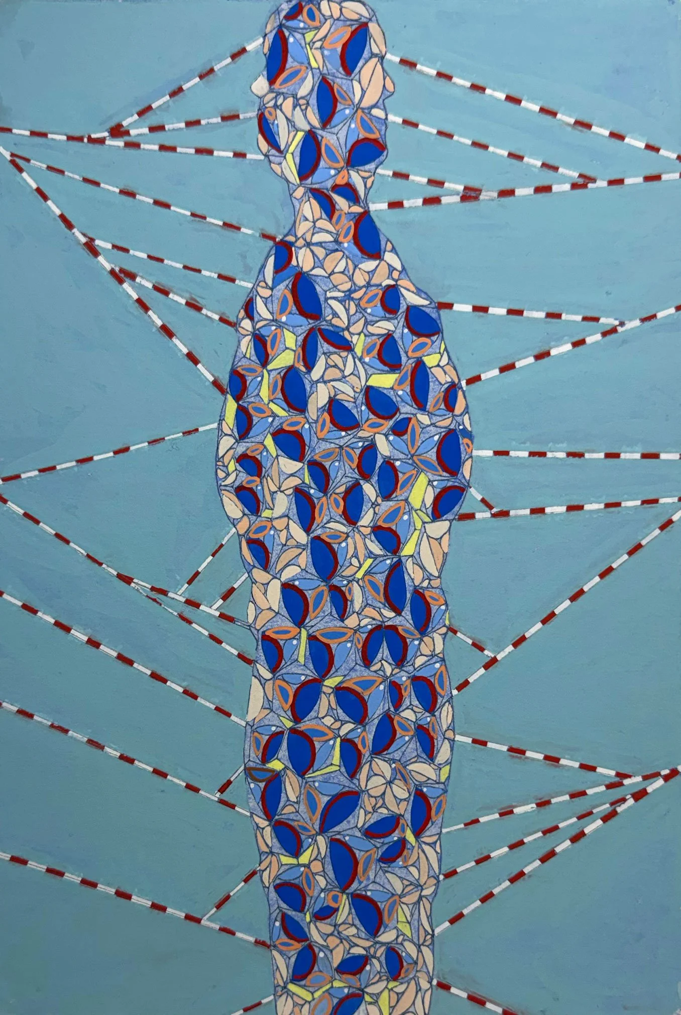
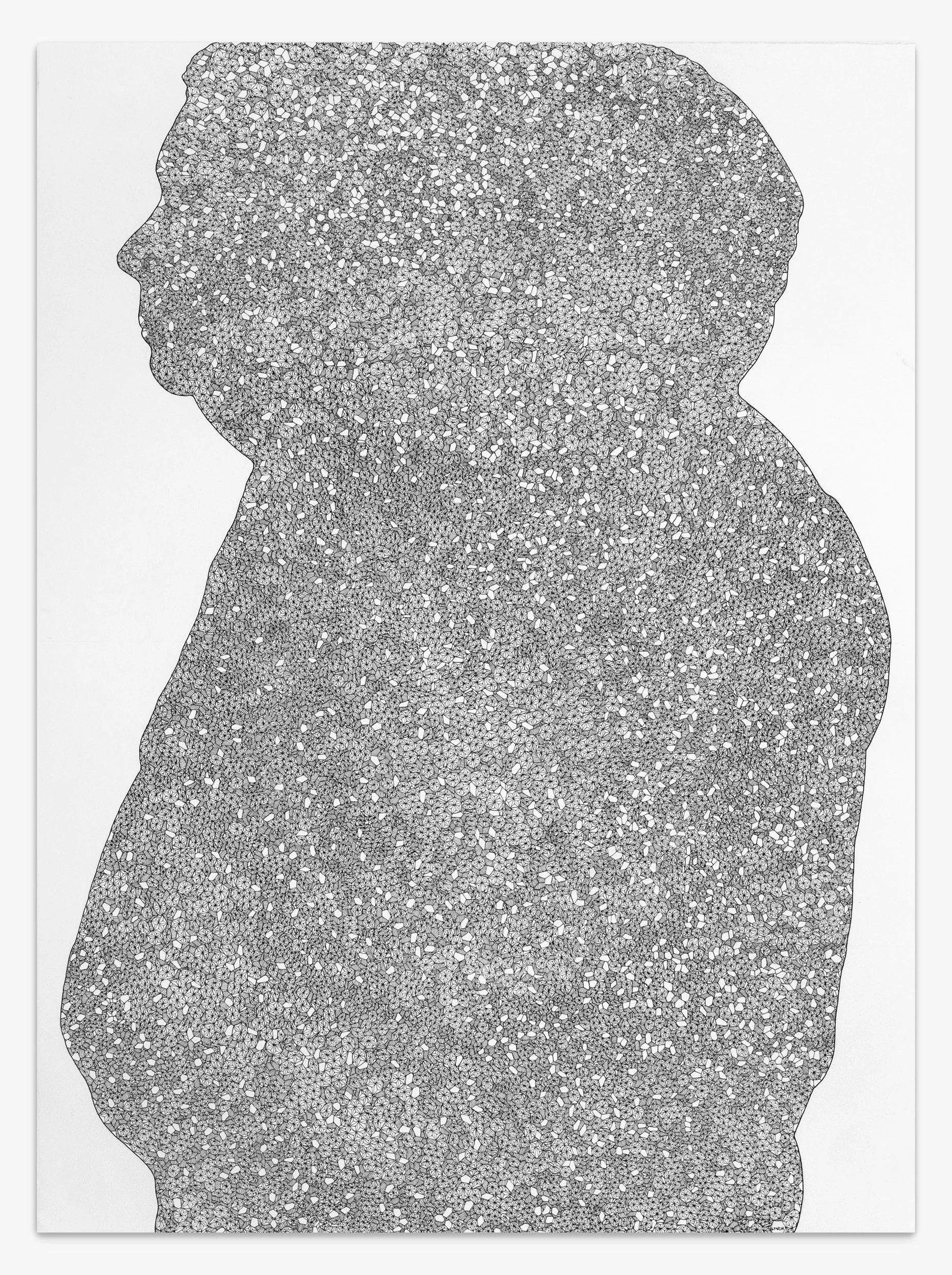
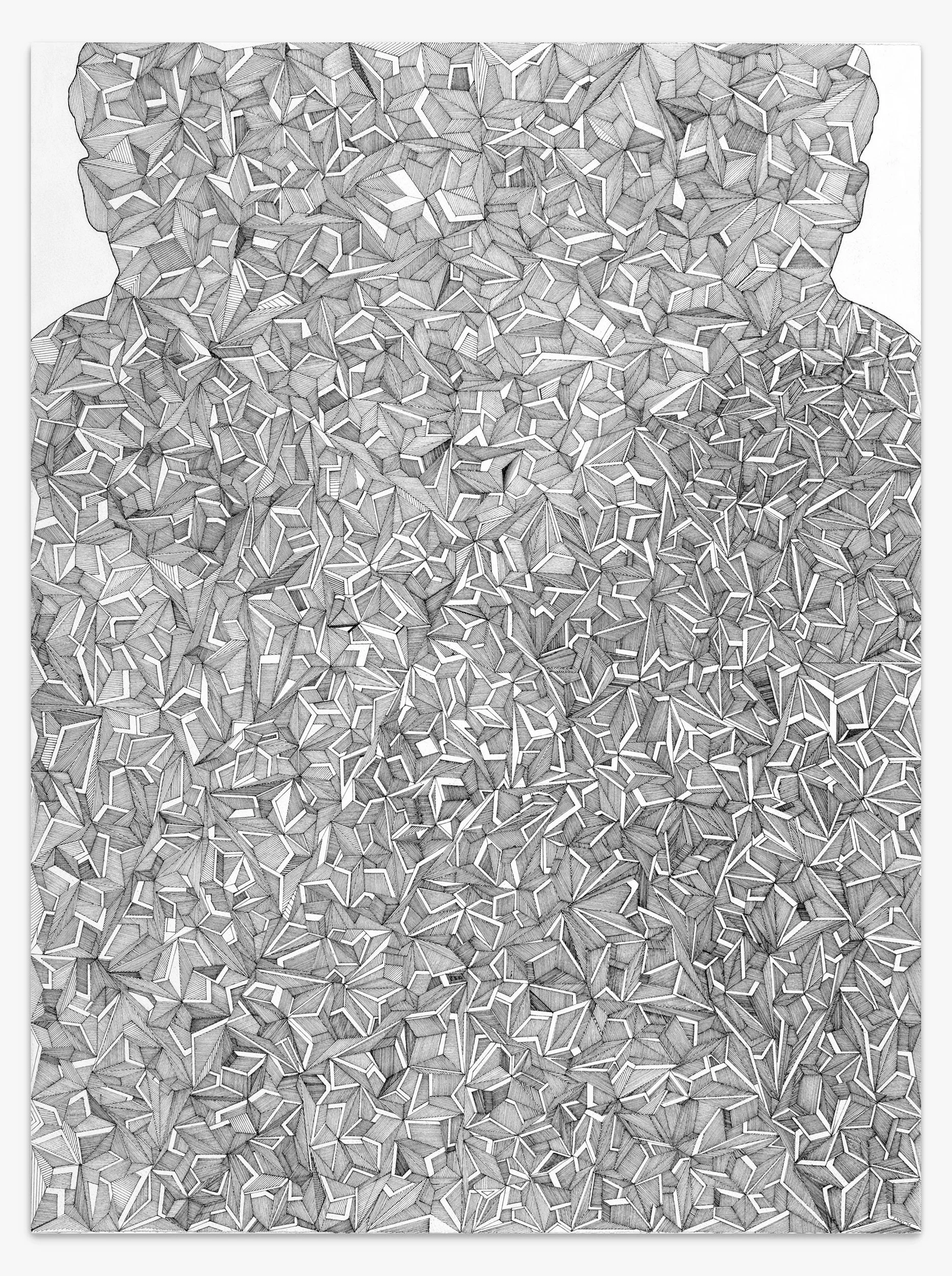
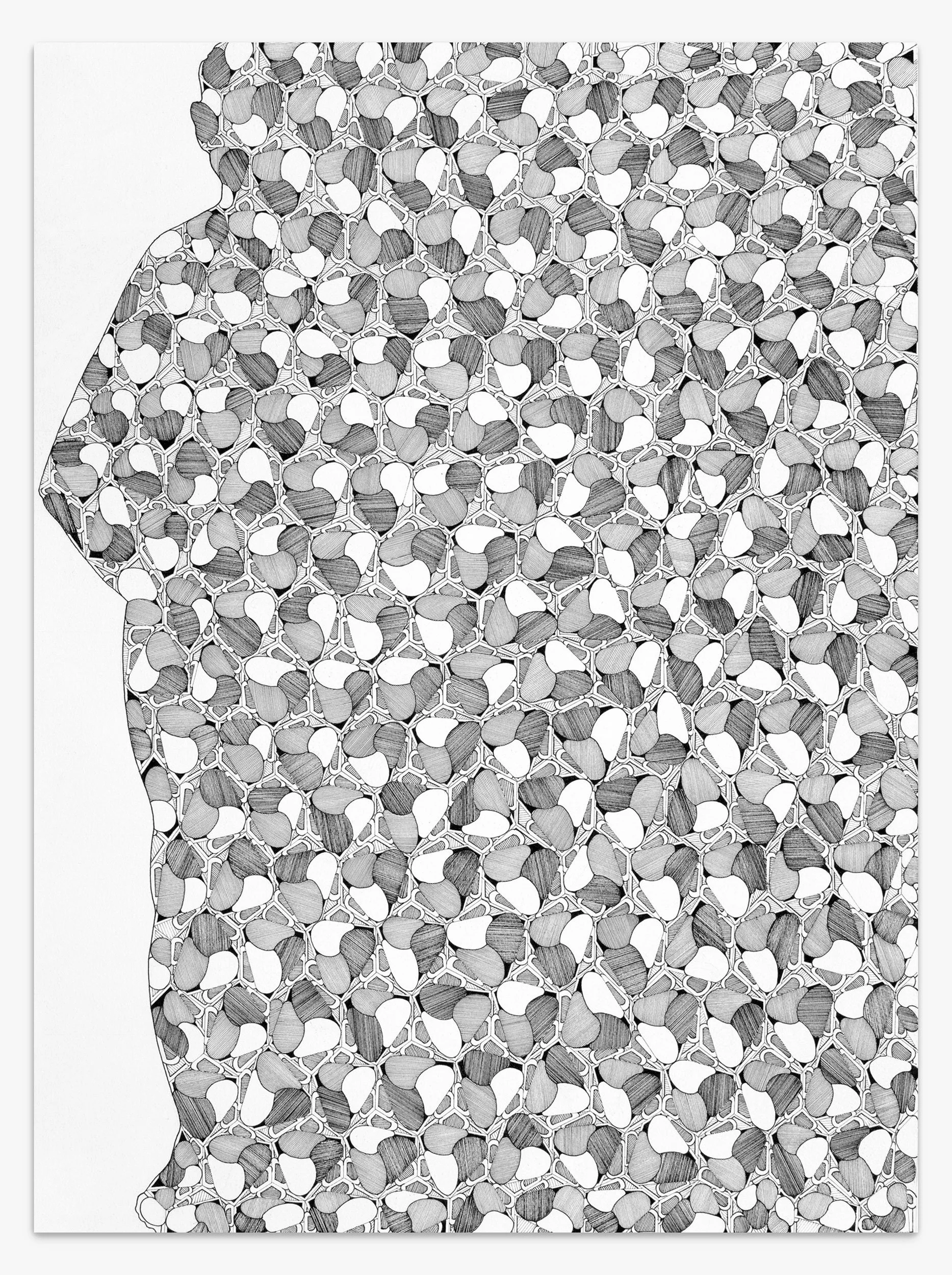
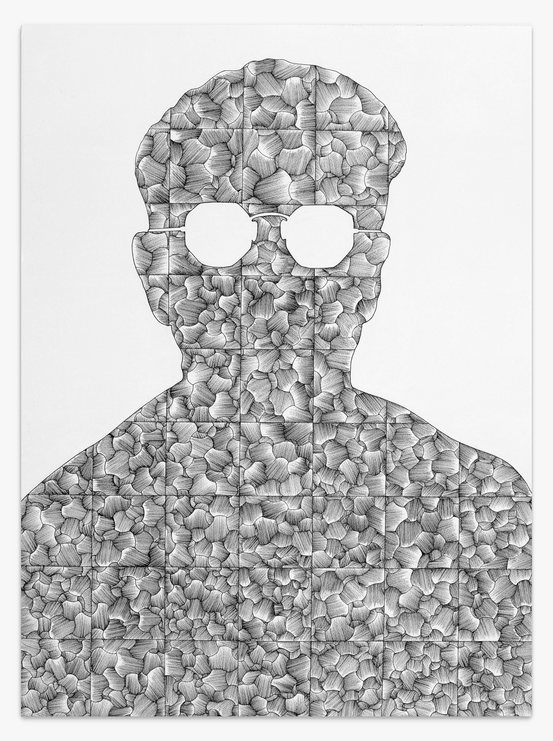
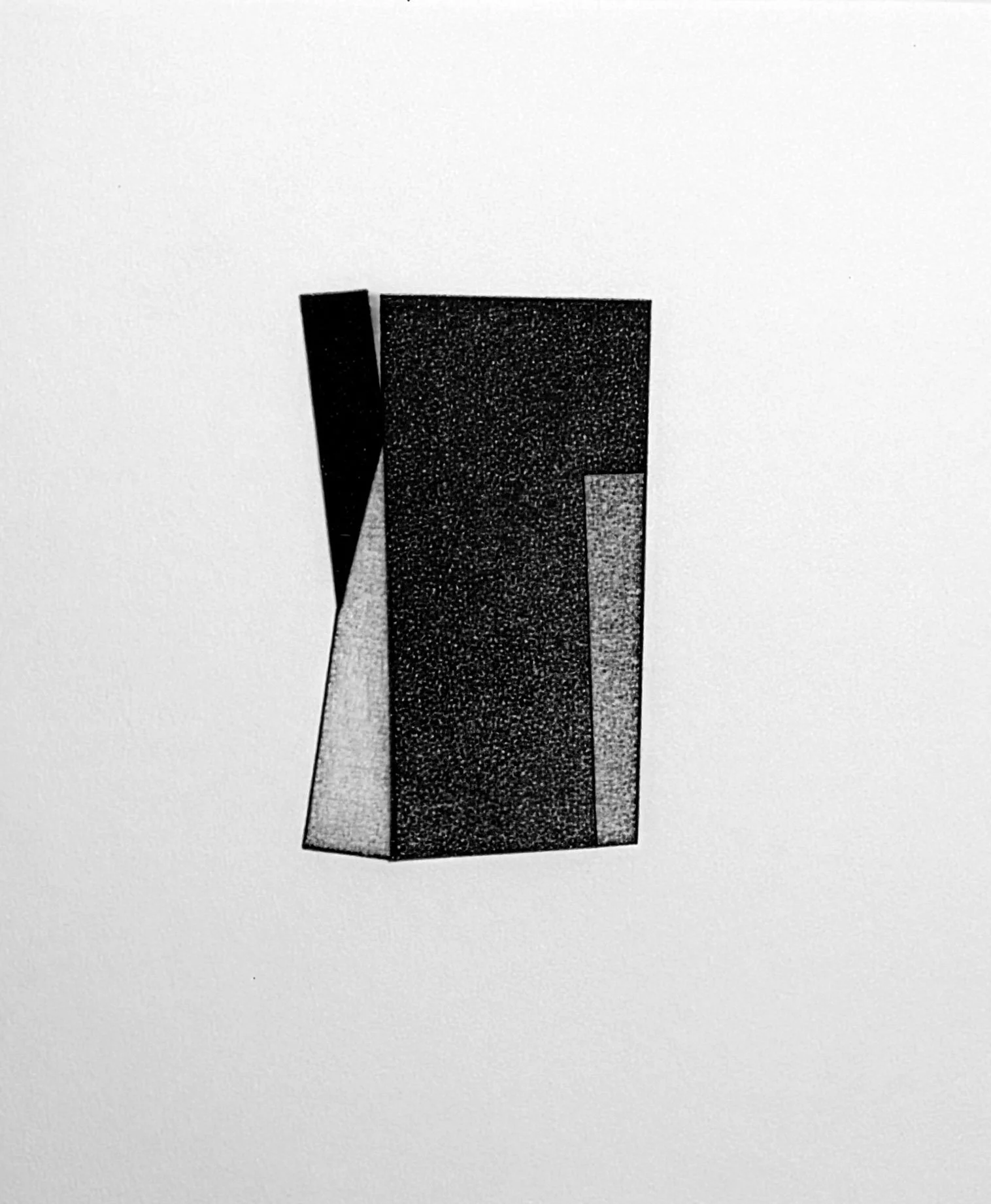
Among his most compelling late works is the Divided Man series, created during his battle with cancer. In these deeply personal paintings, Lynch combined figurative imagery with the abstract forms that had long defined his practice, exploring themes of mortality, resilience, and the fragmentation of self. The series stands as a powerful reflection on the human condition and a poignant culmination of his lifelong artistic inquiry.
Through his thoughtful and innovative approach to painting, Lynch created a lasting legacy that continues to inspire viewers and artists alike.
Selected Works
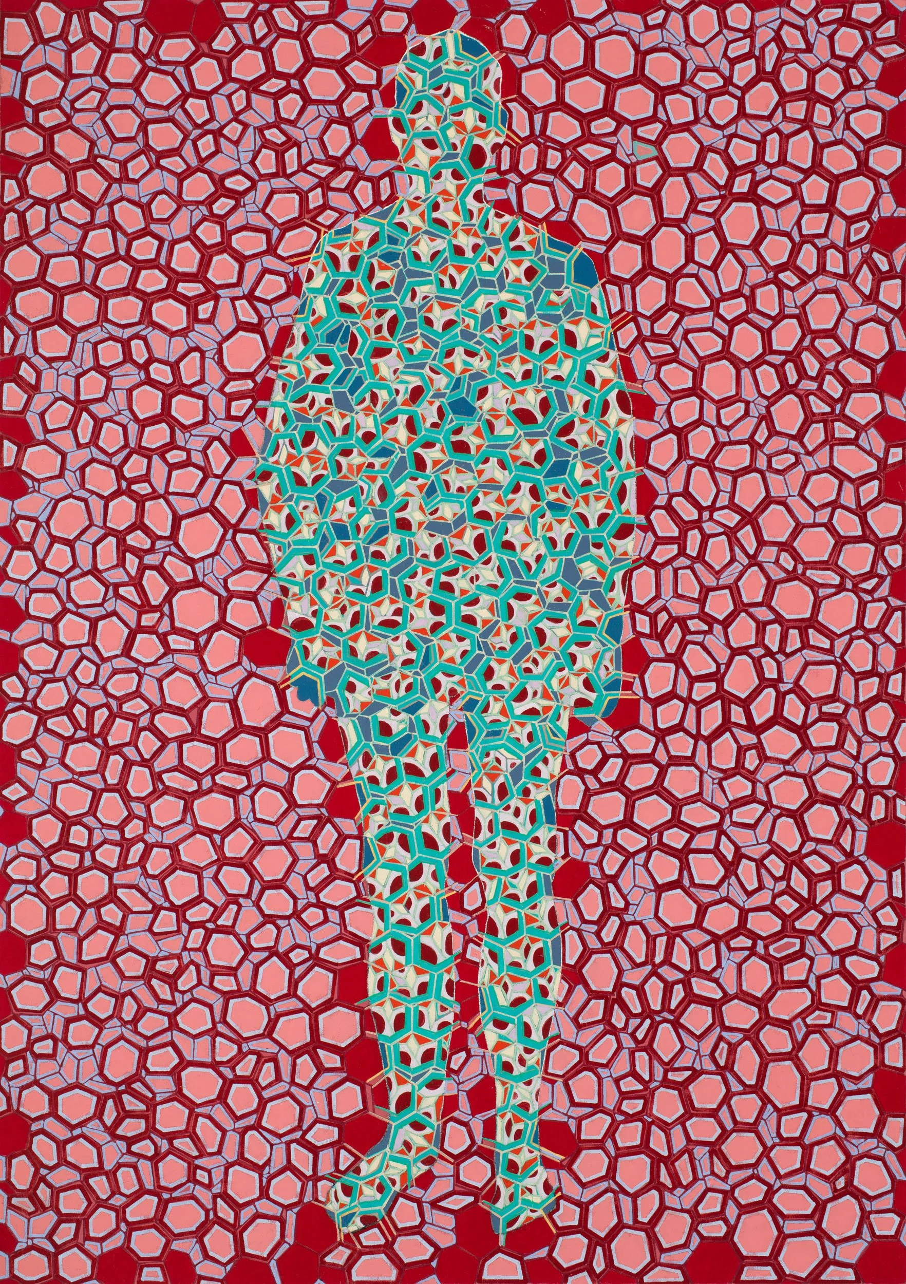
Divided Man 32 — Earthly Only
68 x 48 inches
Oil on canvas
2016
Division Man 26
48 x 34 inches
Oil on canvas
2015

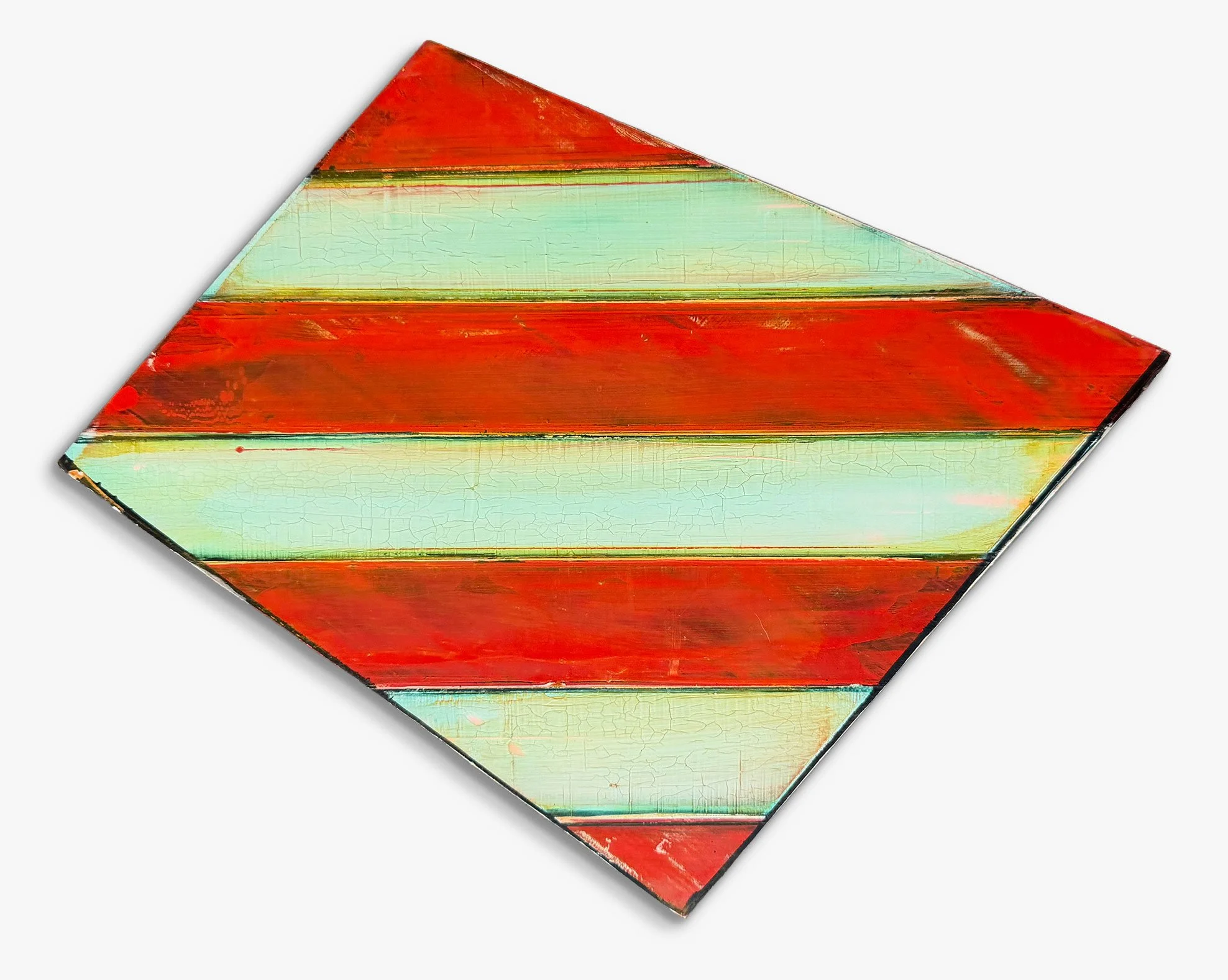
Striped Painting (992)
48 x 34 inches
Oil on canvas
c. 1994
Rotoform (966)
48 x 34 inches
Oil on canvas
1994
Rotoform 25 (1019)
48 x 34 inches
Oil on canvas
1995
Rotoform 19 (1013)
48 x 34 inches
Oil on canvas
1995
Untitled
13 x 15 inches
Acrylic on panel
1988
Untitled
11.75 x 14.5 inches
Acrylic on panel
1988
Untitled
11.75 x 14.5 inches
Acrylic on panel
1988
Planar (760)
10.5 x 13.25 inches
Acrylic on panel
1991
Planar (754)
10.5 x 13.25 inches
Acrylic on panel
1991
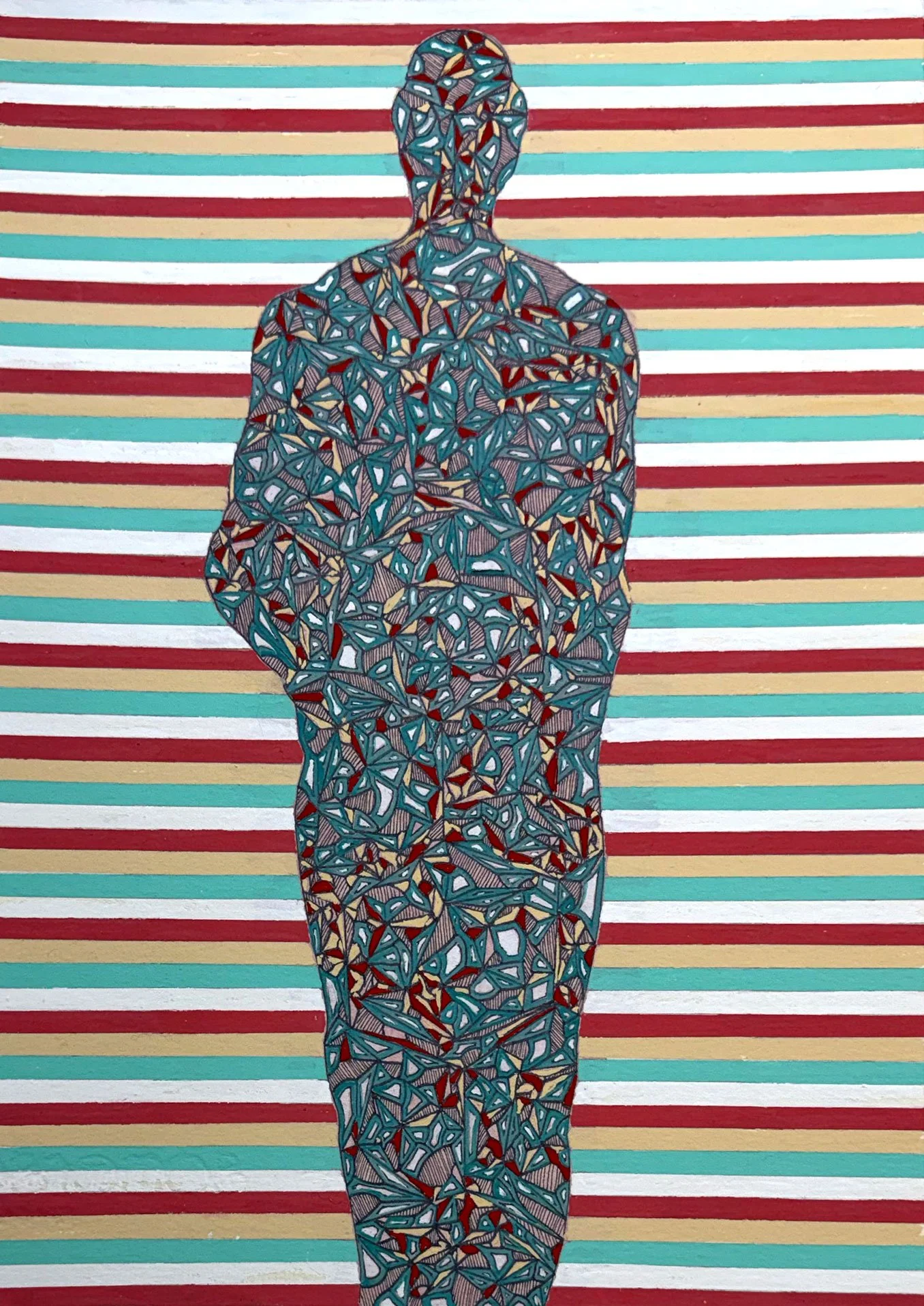
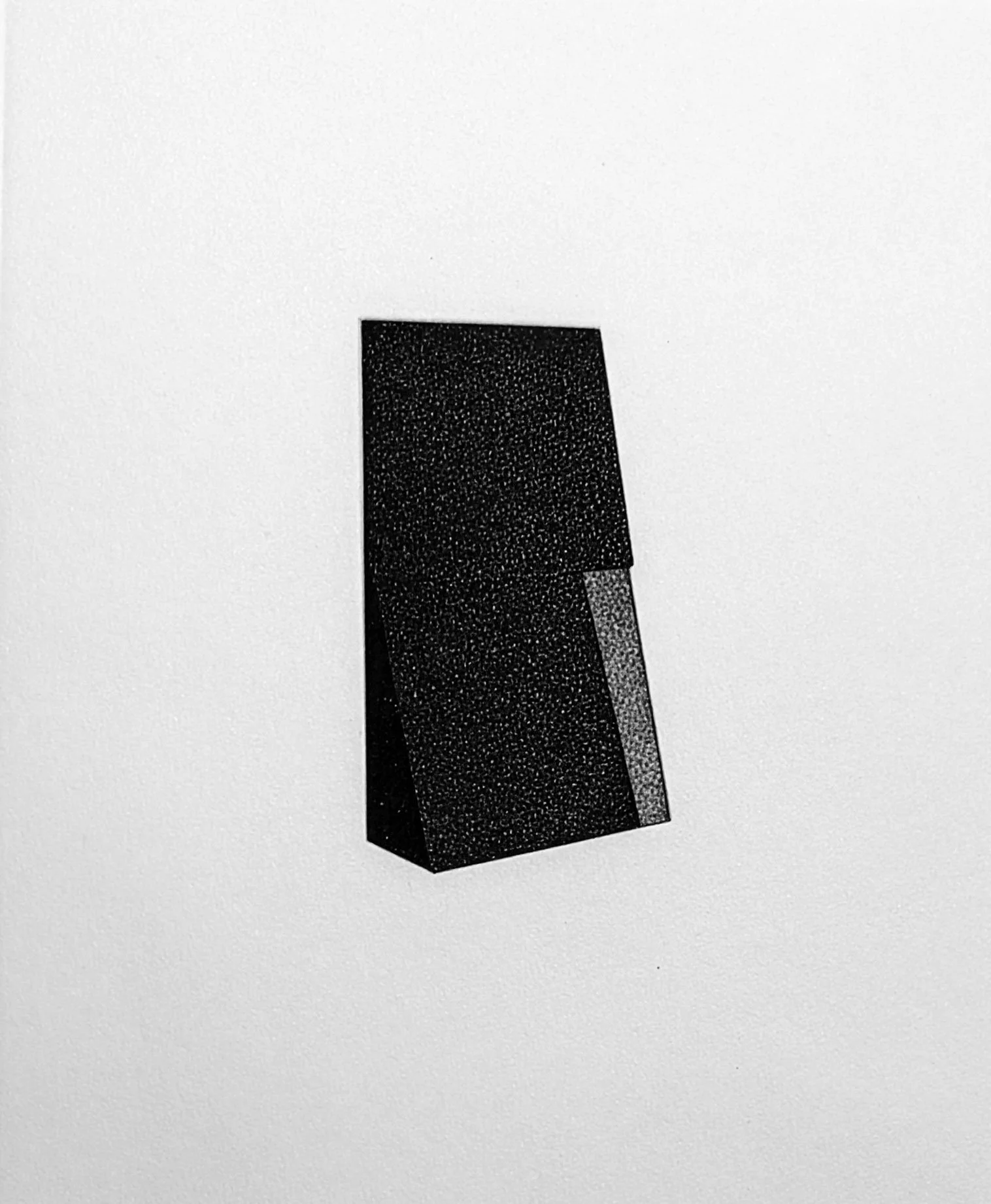
Division Man
11 x 7.5 inches
Gouache on paper
2014
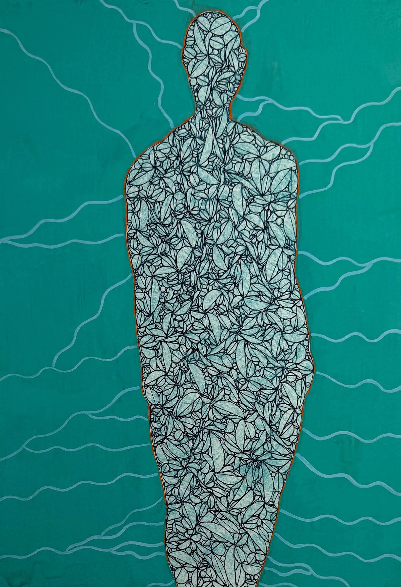
Division Man
11 x 7.5 inches
Gouache on paper
2015
Division Man 11
11 x 7.5 inches
Gouache on paper
2015

Untitled
11.25 x 10.25 inches
Gouache on paper
1993
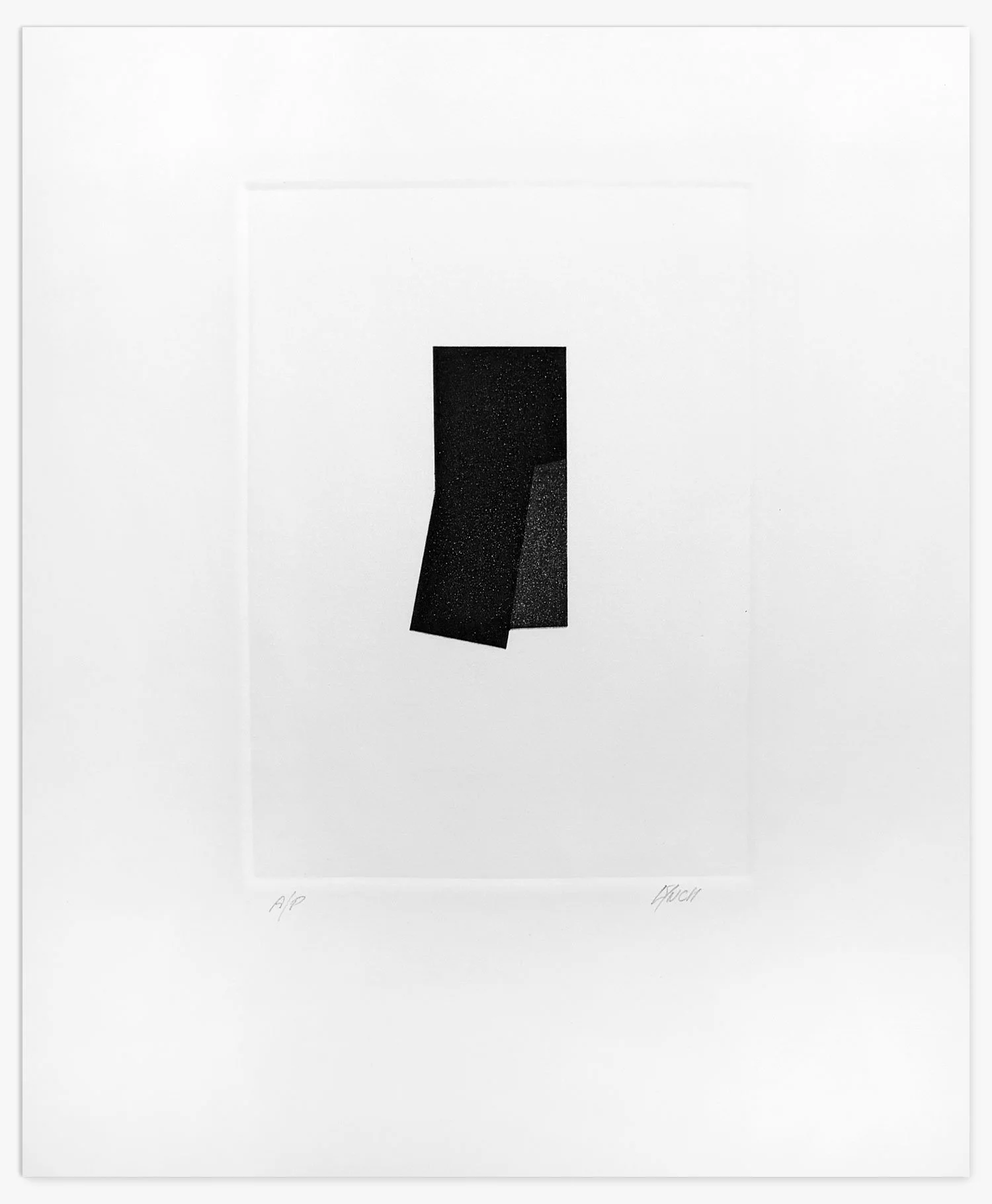
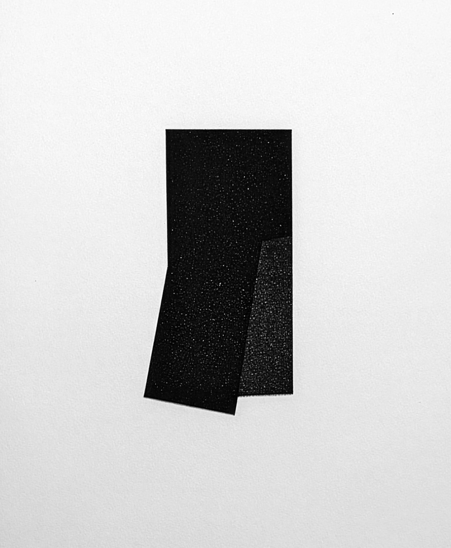
Divided Man Drawing #3
30 x 22 inches
Ink on paper
2016
Divided Man Drawing #7
30 x 22 inches
Ink on paper
2016
Divided Man Drawing #8
30 x 22 inches
Ink on paper
2016
Divided Man Drawing #9
30 x 22 inches
Ink on paper
2016
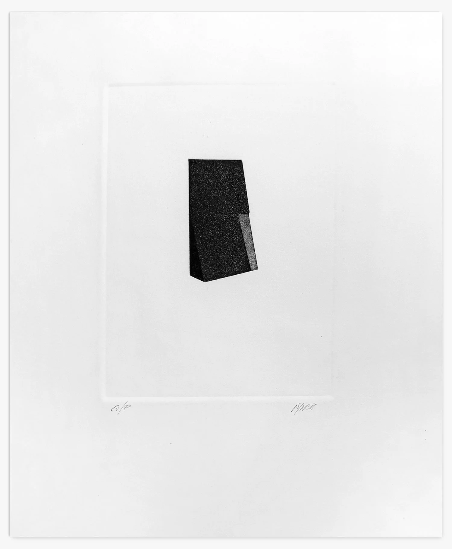
Untitled (38)
12.75 x 10.5 inches
Etching
c. 1980s

Untitled (39)
12.75 x 10.5 inches
Etching
c. 1980s
Untitled (41)
12.75 x 10.5 inches
Etching
c. 1980s
Untitled (42)
12.75 x 10.5 inches
Etching
c. 1980s
Untitled (43)
12.75 x 10.5 inches
Etching
c. 1980s

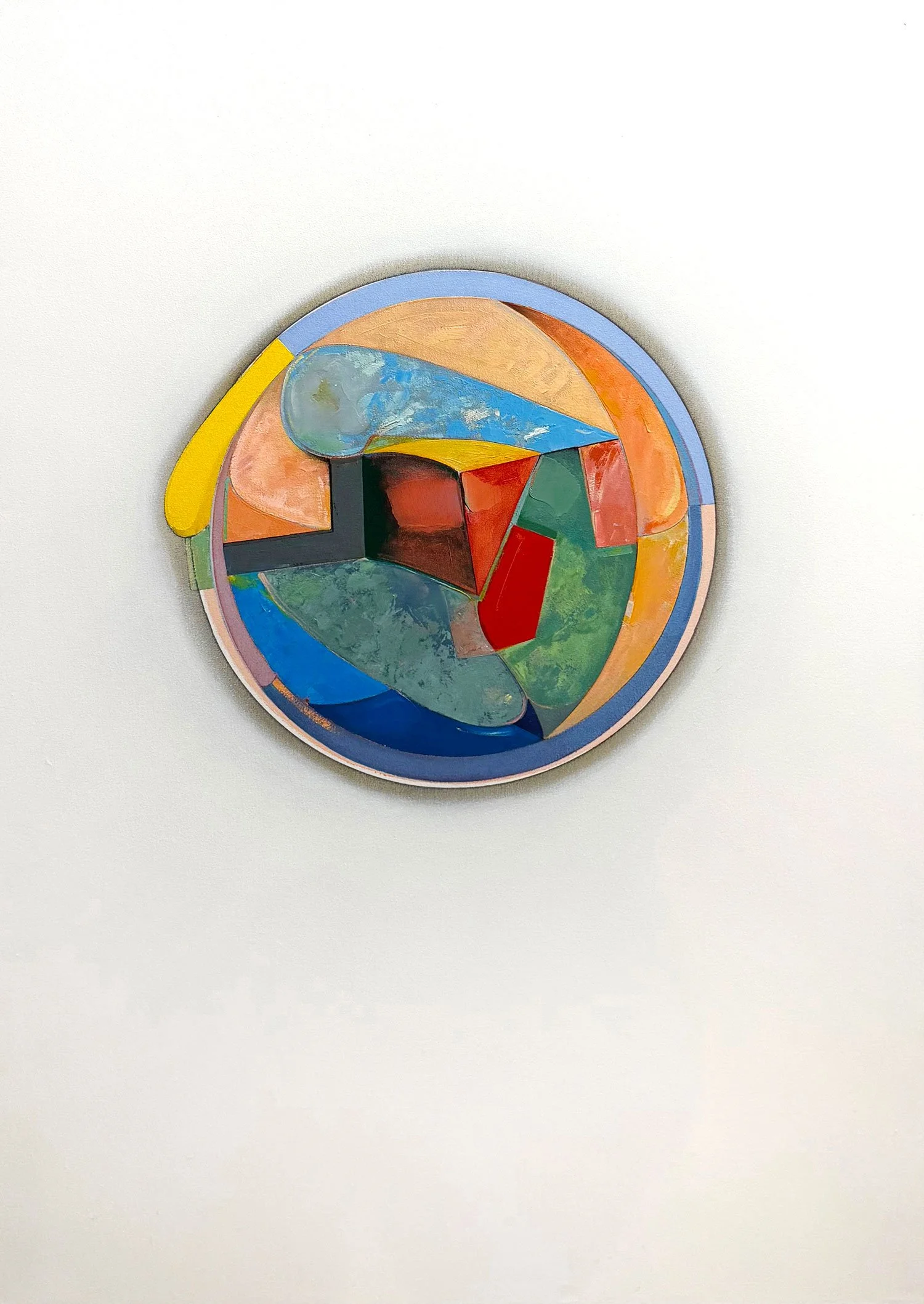
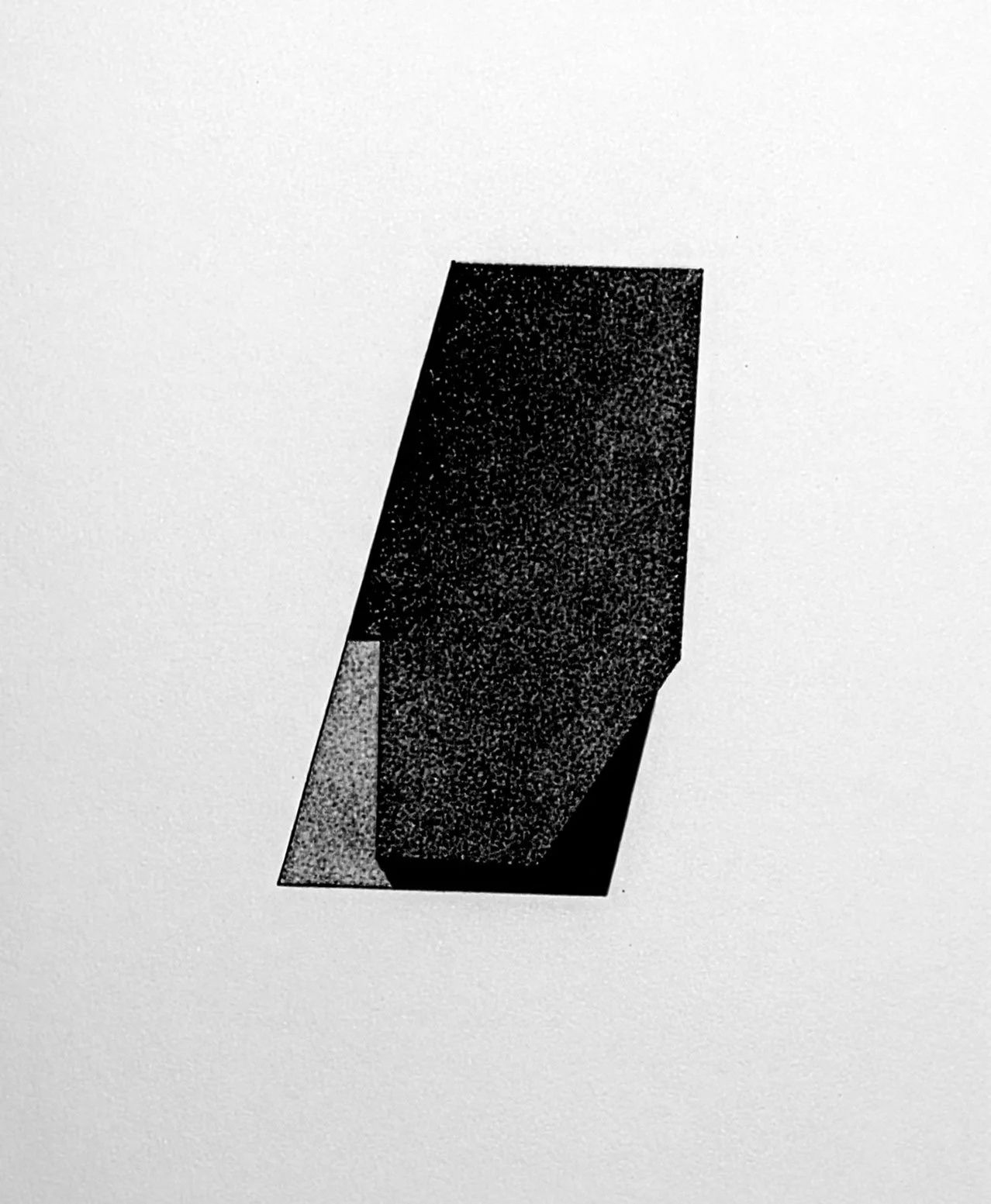
Division Piece #66 (Abydos)
18 x 22.5 inches
Oil on Masonite with wood
2013

Division Piece #74
24.5 x 31.75 inches
Oil on Masonite with wood
2013

Artist Statement
Thoughts on Painting
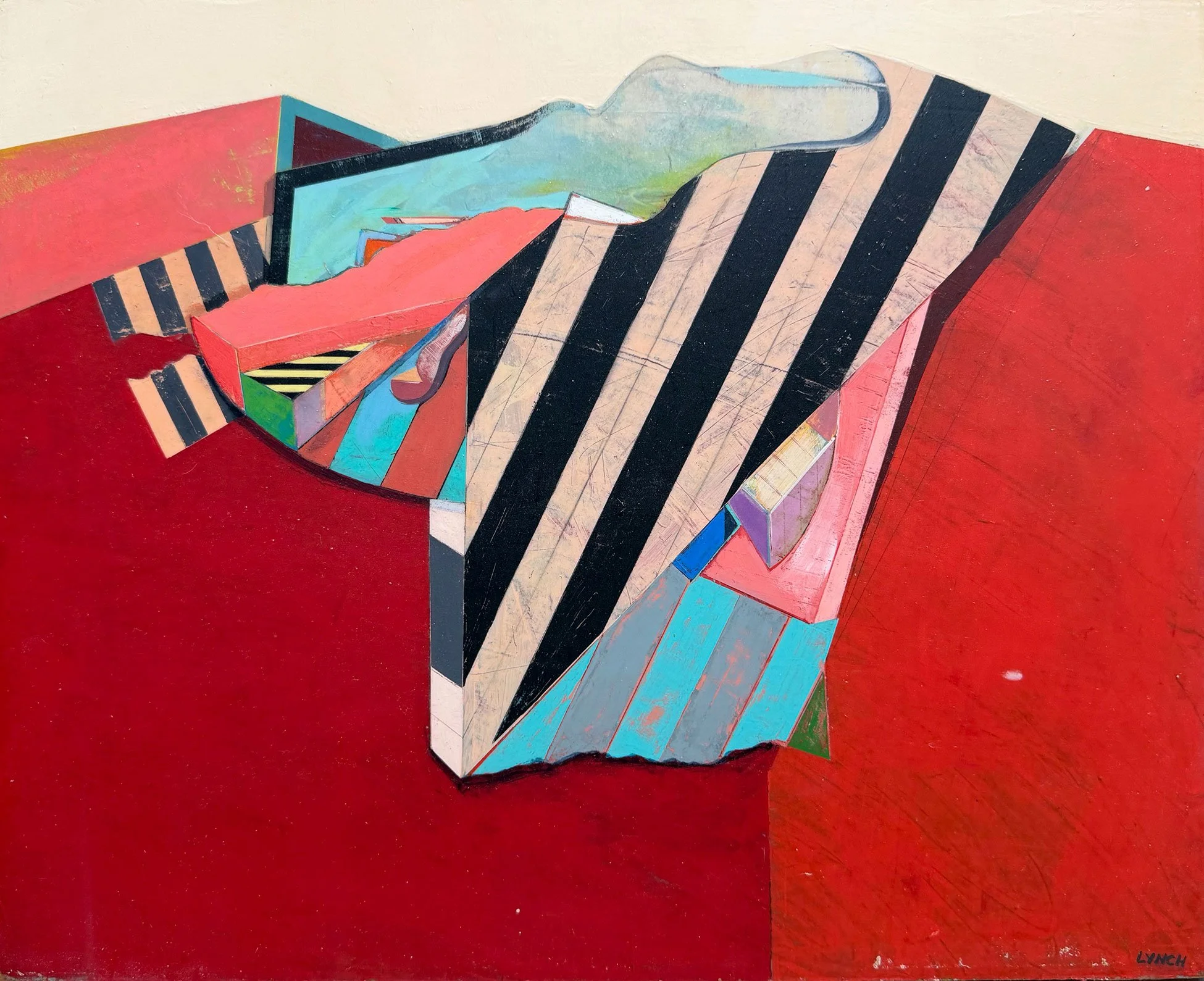
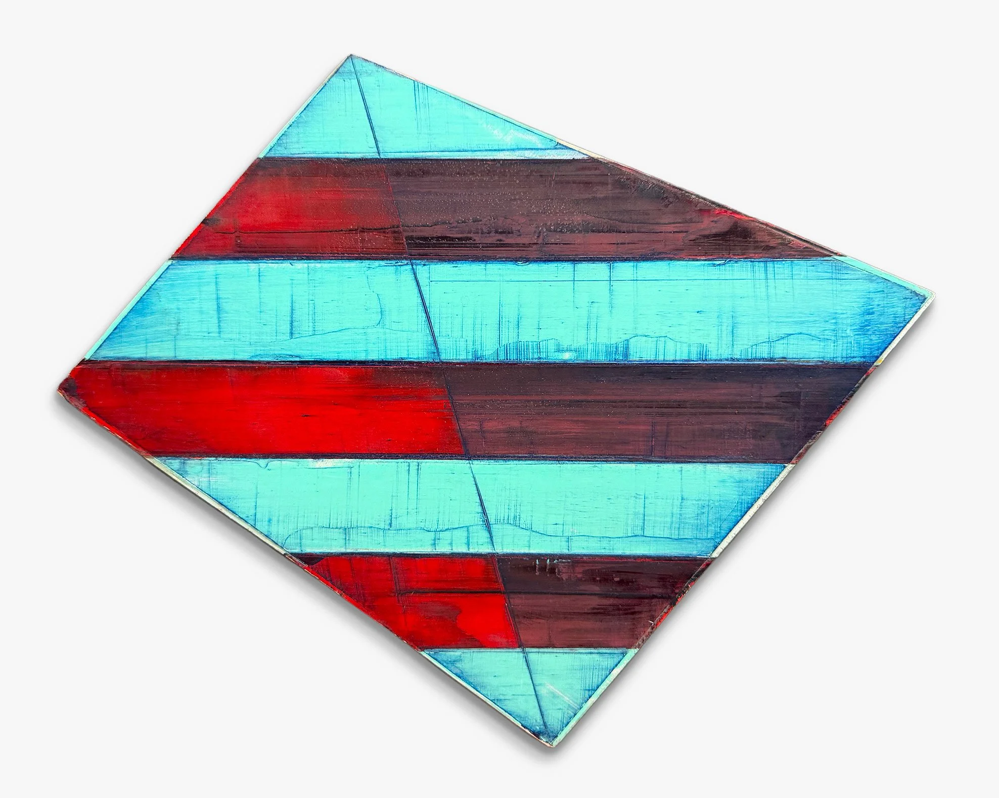
Painting is primarily about the sensations produced when a fairly flexible material is applied to a somewhat inert material. Painting is about paint, about its color, light and surface, evolving into subject matter, form and content.
My paintings, consisting of alternating bars of color, are basically presentations of light, texture, and pattern, with suggestions of implied space and vaguely familiar structures. They are also about repetition, sequence, variation and the nuances of a series approach. Just ahead of these concerns is a high regard for the paint itself, fluid, viscous, gelatinous, almost voluptuous. Although more often pressed into the service of representation, paint retains its own character. Whether crystalline or creamy, skin-tight or flaky, the substance of paint has a life of its own, with rich metaphorical possibilities, independent of illusion and description.
Paint is the subject, if not the form, in some abstract paintings. In my paintings, though, it is an integral means to a more compelling end. The various bars of color, usually interspersed with similar widths of more neutral tints and whites, represent for me the infinite, astonishing variations that the stripe contains. These possibilities include scale and proportion systems, geometrical and mathematical configurations, and reflections on ideal shape and format.
The stripe has been part of me since my undergraduate days at Massachusetts College of Art. As a figurative painter, I saw the stripe motif as a useful decorative device. Much of my work then dealt with clothing, worn as façade and front. To this end, intense, multi-chromatic stripe patterns presented the viewer with form and content simultaneously, decorating and deriding the figure with the same idiom. This (the 60’s) was the age of the double-knit suit, day-glow colors, and bell-bottoms.
Eventually, the stripe became a significant aid in describing form alone, for implying contoured planes, and as a way of contradicting expected illusion. The social context became more ambiguous, the figure gradually giving way to forms more abstract and mechanical. The paintings done at this time (70’s and early 80’s) were of things, not people. They were about forms that clashed, as nature and civilized elements often do. The stripe became flatter, simpler, more emblematic rather than descriptive.
One might be reminded of crests, shields, and simple signs. These stripes were broader, less varied in color schemes, and more binary in makeup. More emphasis was placed on contrast, often between two colors only. More likely, the design approached closer to a black and white condition than a rainbow. The stripe areas of these paintings, shard-like and insulating, acted as foils for less organized, more visceral elements in ersatz landscape arrangements.
Finally (or at least presently), the essential characteristics of contrasting forms, equal but different, lie at the heart of my work. Freed from any decorative or descriptive obligations, alternations of color and space can produce visualizations of intense metaphorical power. Stark landscapes with multiple horizons, barred openings, and esoteric grids emerge as subject matter. The allusion to these elements is incidental to other concerns, but the inferences are quite possible. The simplicity of the paintings allows for many individual interpretations.
As a purely optical statement, no other visual motif speaks as clearly and emphatically as the stripe. The eye responds almost violently to the conflicting sensations caused by high contrast of color and light. When the repetition of contrast is pronounced and rapid, perceptual movement is apparent; when the stripe narrows in width, this movement becomes quite active. Thus, the painting becomes charged with energy that confronts and engages the viewer in unique ways. This power to physically involve the audience is one of the aesthetic challenges for the painter.
I look for ways that will allow optical effects to enrich rather than dominate the paint surface. I want movement to remain a gentle contradiction to the more solid array of individual color areas. I choose combinations and proportions that touch only lightly on the “eye dazzle” or perceptual ambiguity. To me, the psychological ambivalence expressed by opposites, of black vs. white, strong against weak, is more important. I try to state these conditions through proportional, dimensional, and scale variations. The number of variations seems endless, the differences subtle, and the “perfect” combination elusive.
Frederick Lynch
A Solo Exhibition
July 5 – August 16, 2026
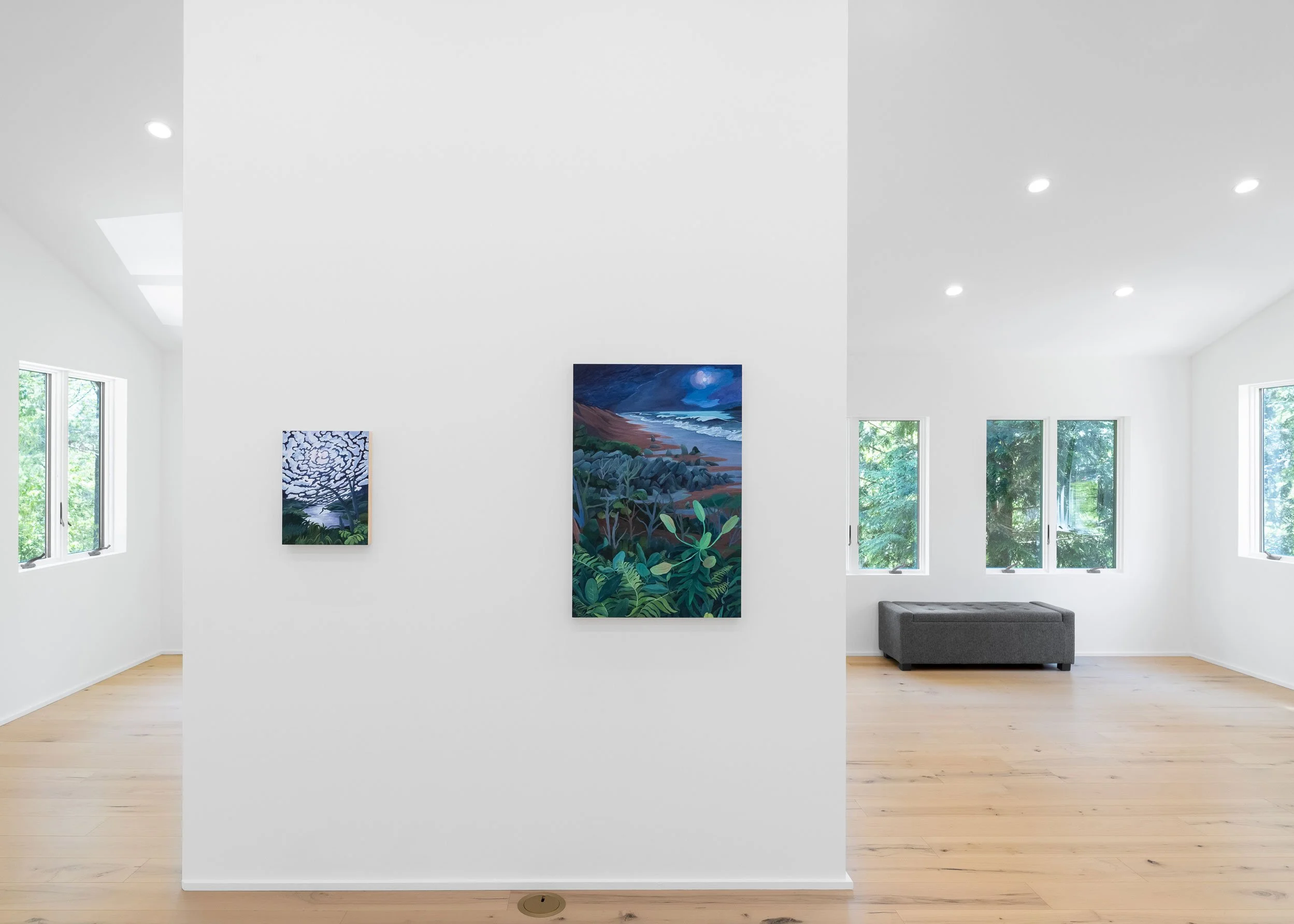
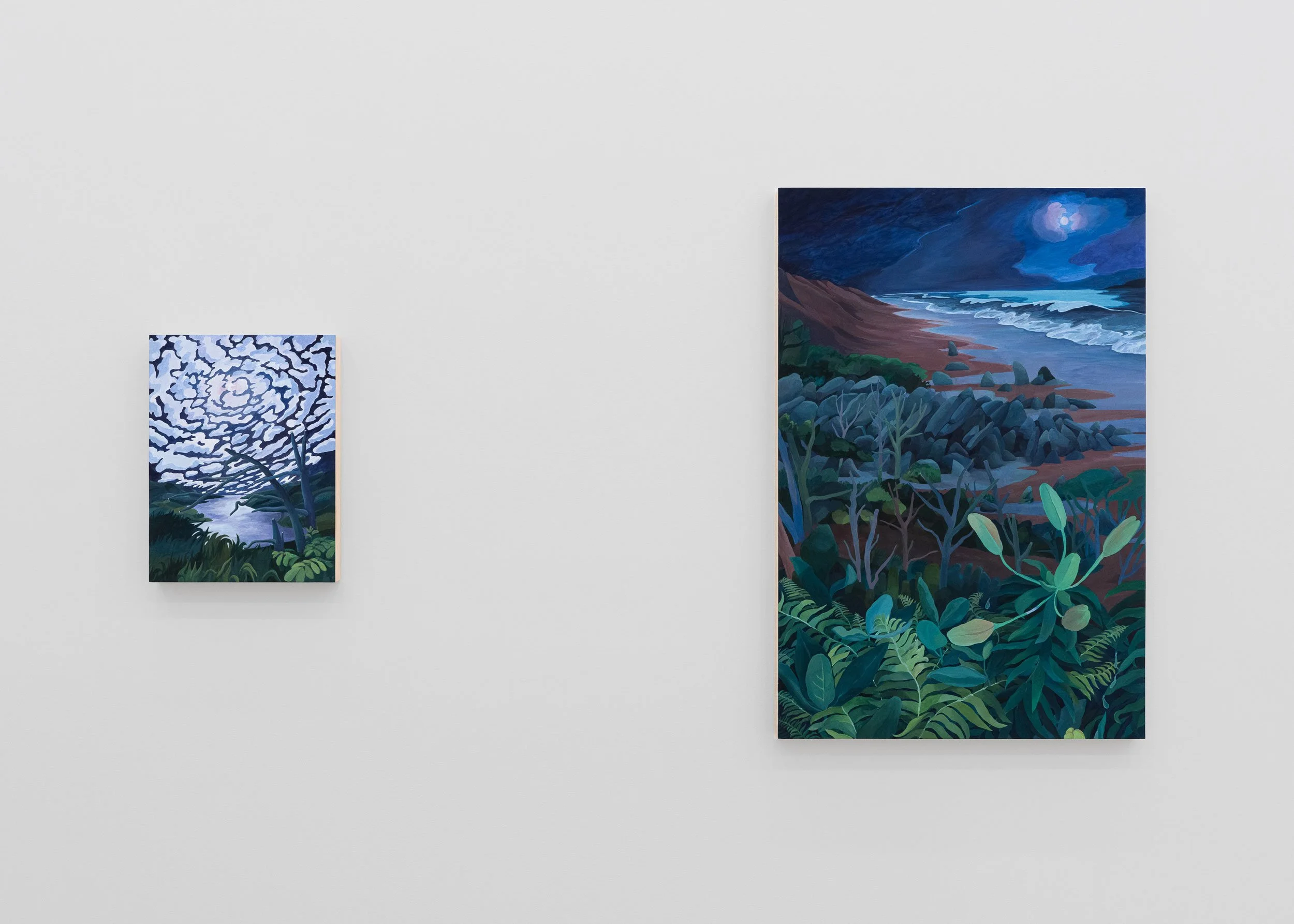
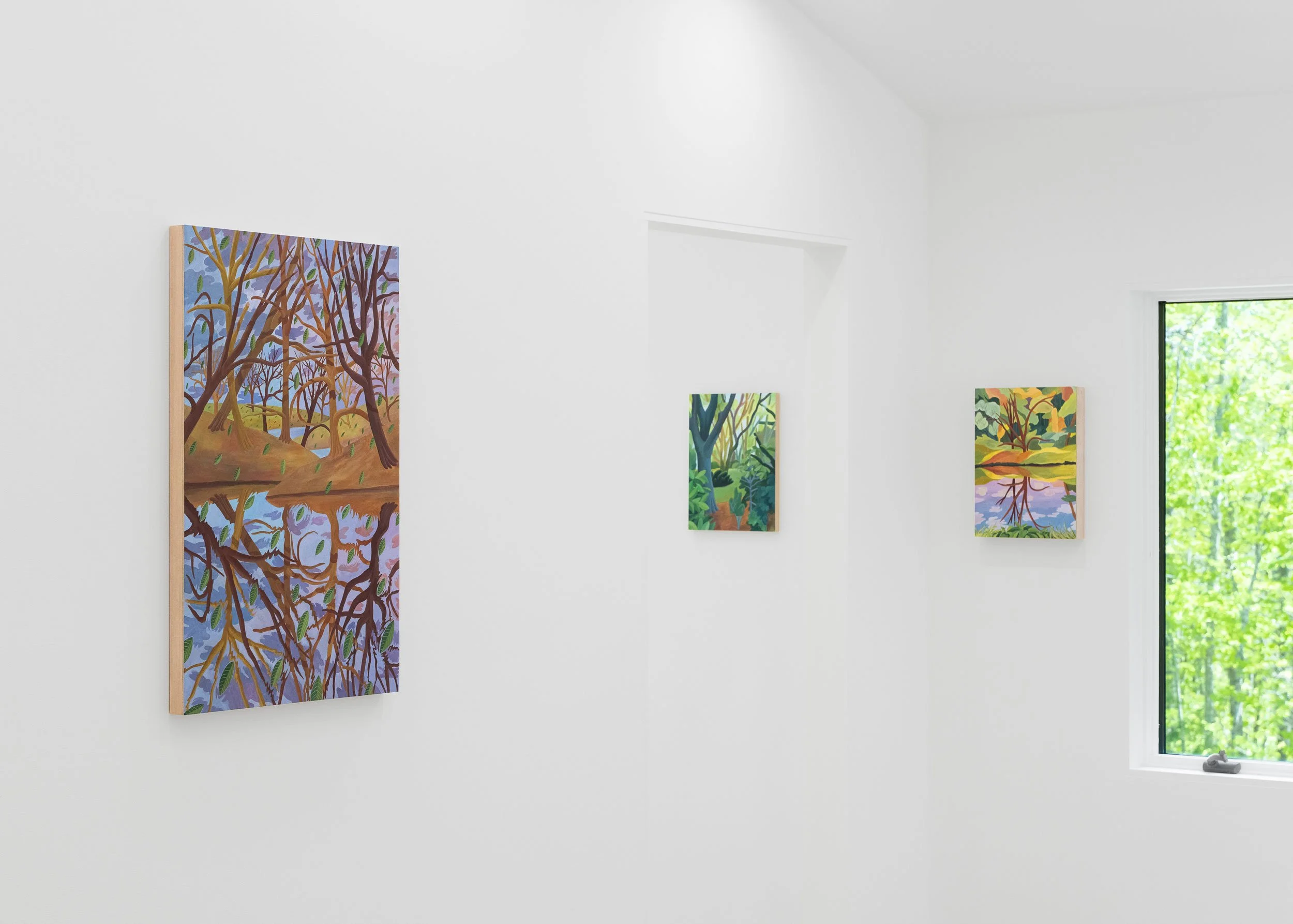
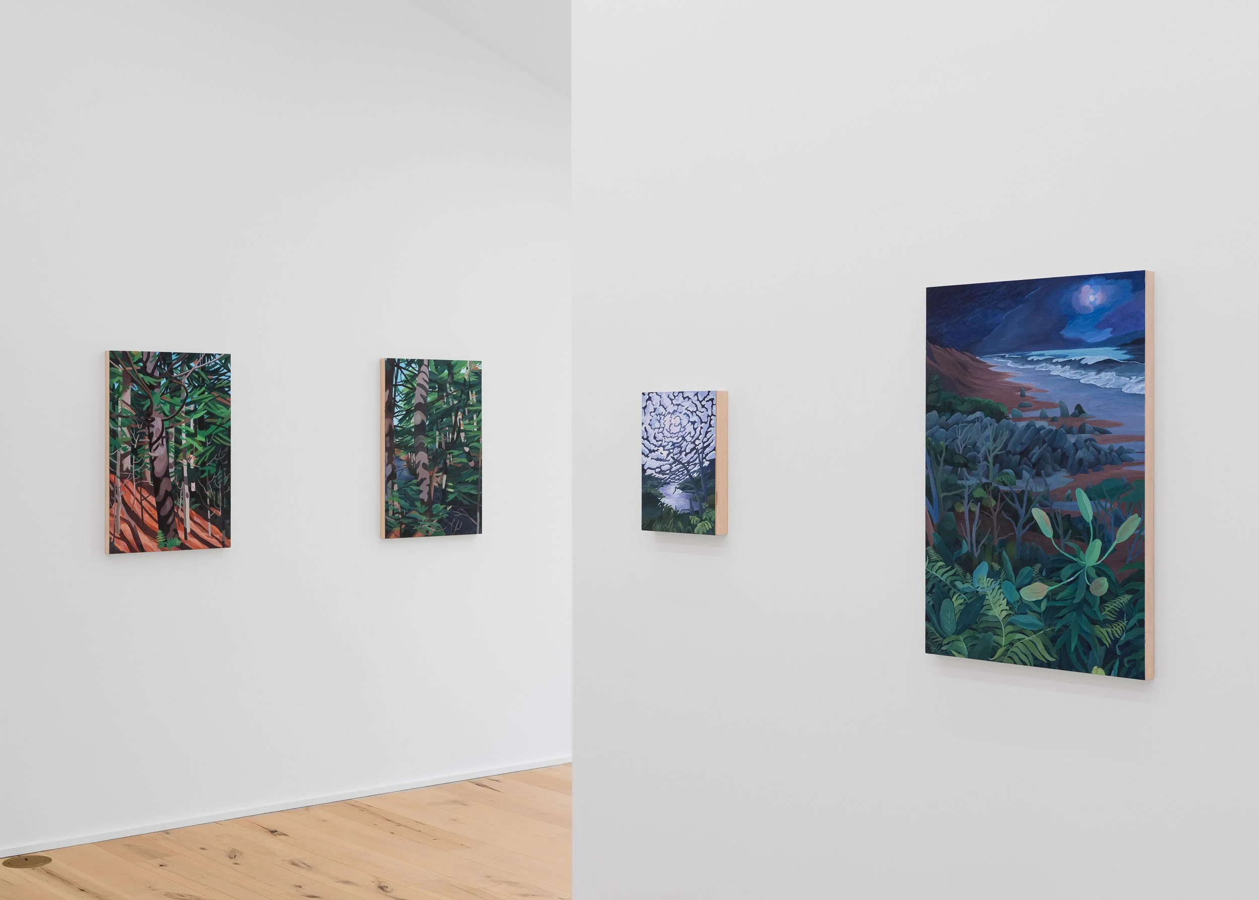
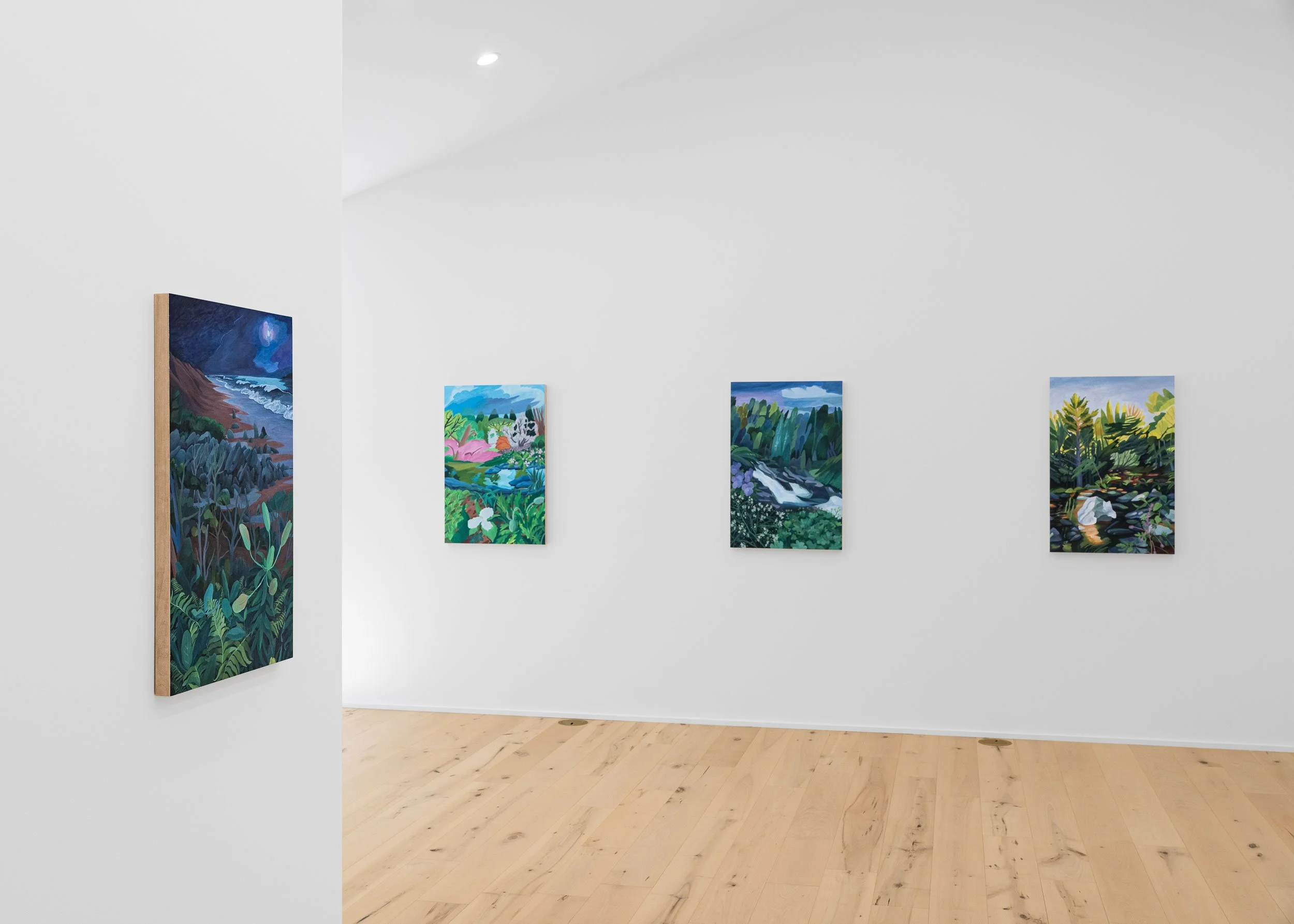
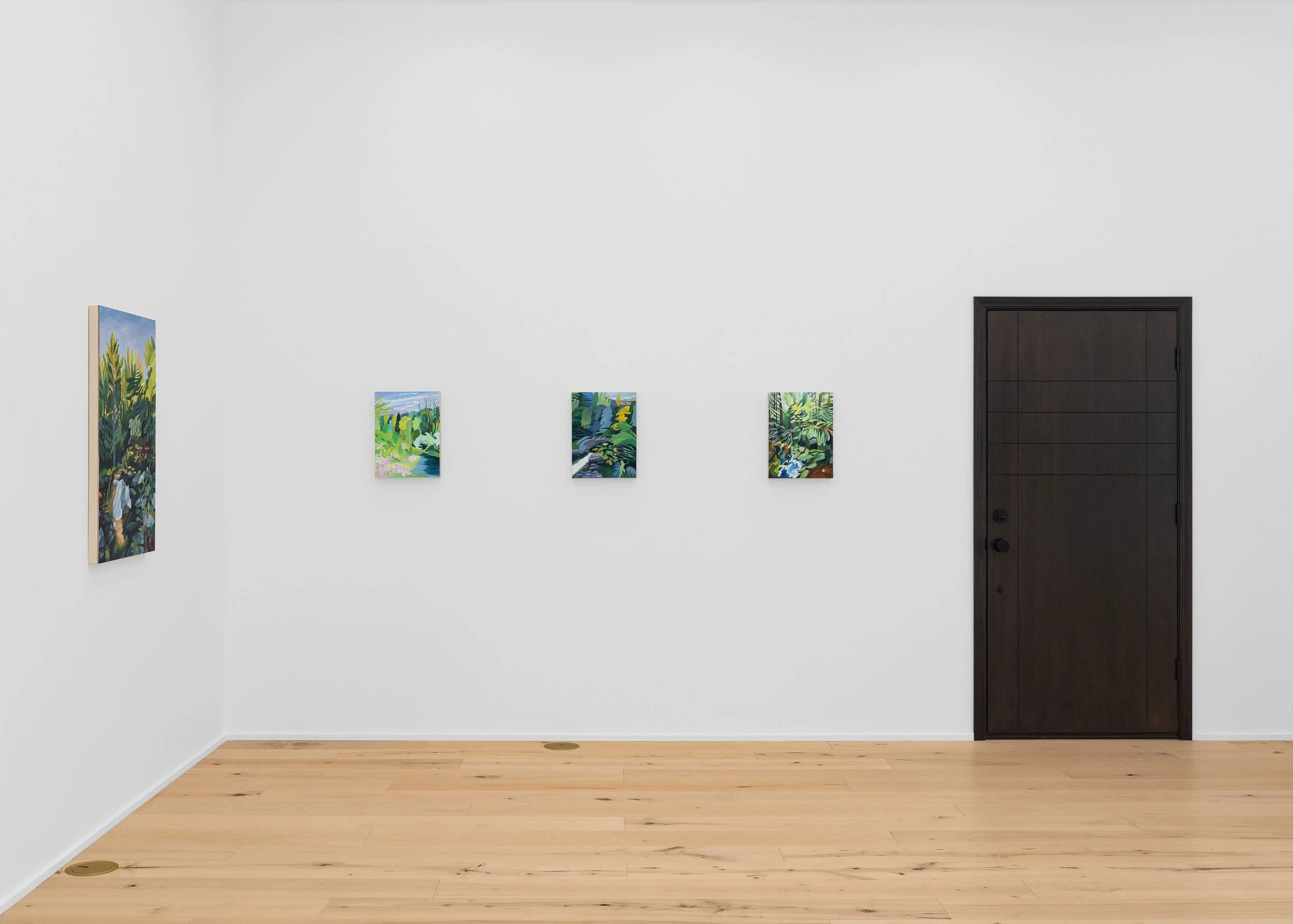
Installation photography © Art Archival